// 변형, Transform
- 위치, 크기, 회전, 왜곡 등
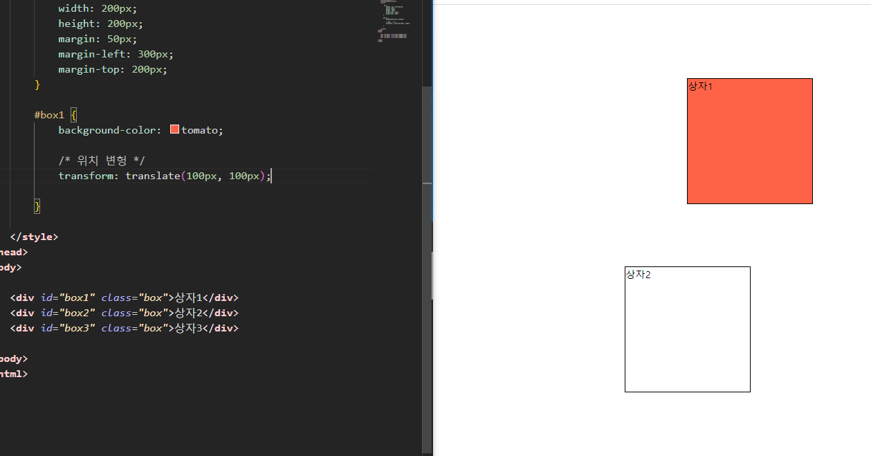
~ transform: translate(): 위치 변형(이동)
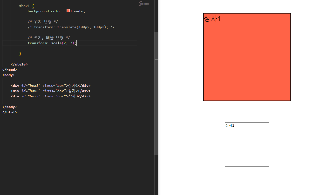
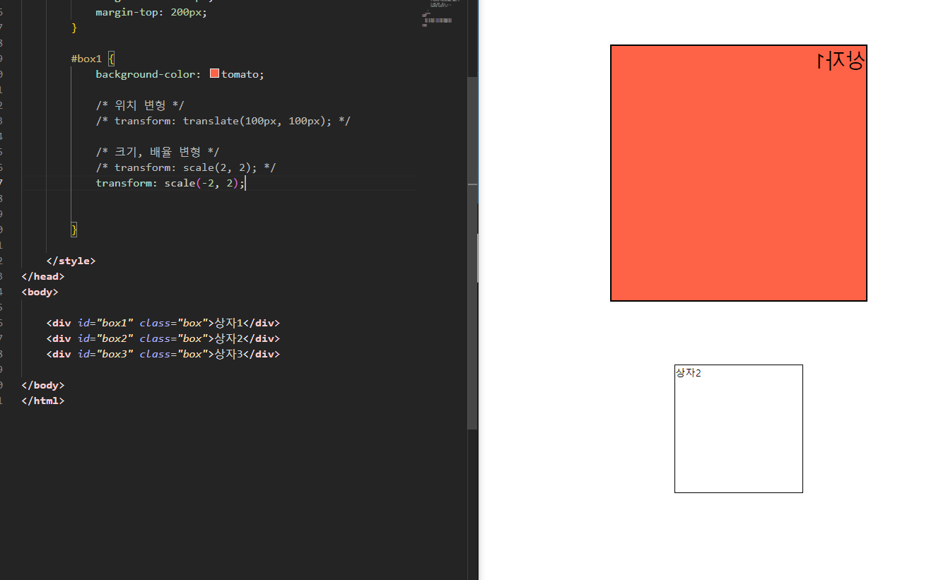
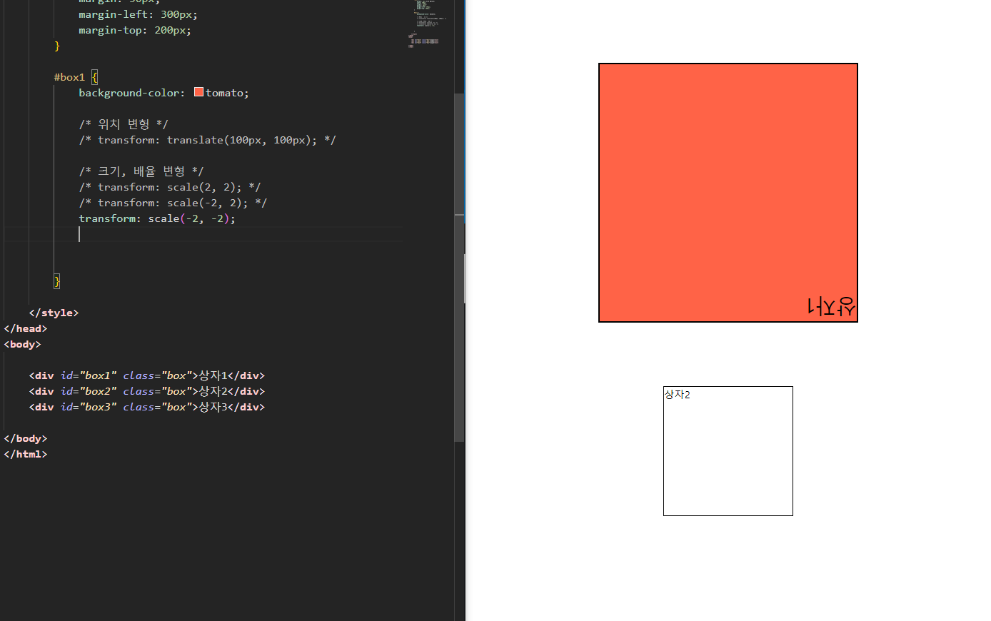
~ transform: scale(): 크기, 배율 변형(확대/축소)
- 단지 크기만 키우는 것이 아님! 그 안의 모든 것이 늘어나고 줄어든다.
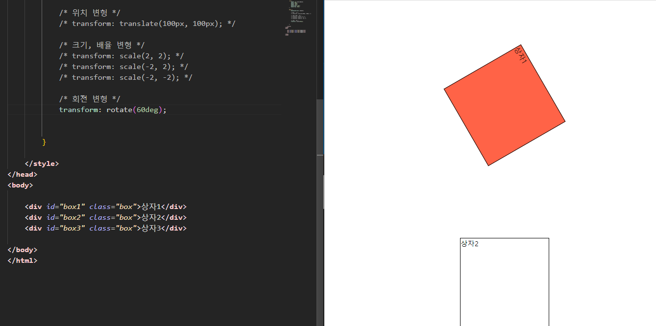
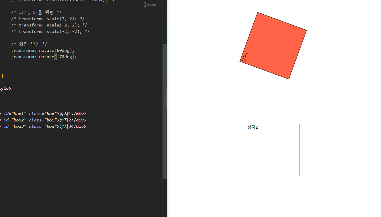
~ transform: rotate(): 회전 변형
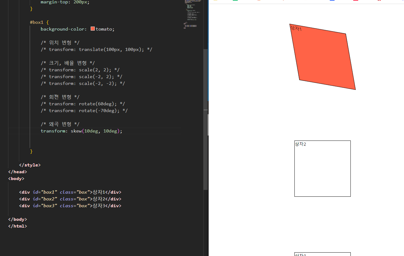
~ transform: skew(): 왜곡 변형(비틀기)
~ transform: matrix(): 위의 4개 포함. 사용자 정의형 > 행렬
- translate()
<!DOCTYPE html>
<html lang="en">
<head>
    <meta charset="UTF-8">
    <meta http-equiv="X-UA-Compatible" content="IE=edge">
    <meta name="viewport" content="width=device-width, initial-scale=1.0">
    <title>Document</title>
    <style>

        .box {
            border: 1px solid black;
            width: 200px;
            height: 200px;
            margin: 50px;
            margin-left: 300px;
            margin-top: 200px;
        }

        #box1 {
            background-color: tomato;

            /* 위치 변헝 */
            transform: translate(100px, 100px);

        }

    </style>
</head>
<body>

    <div id="box1" class="box">상자1</div>
    <div id="box2" class="box">상자2</div>
    <div id="box3" class="box">상자3</div>

</body>
</html>
- scale()
<!DOCTYPE html>
<html lang="en">
<head>
    <meta charset="UTF-8">
    <meta http-equiv="X-UA-Compatible" content="IE=edge">
    <meta name="viewport" content="width=device-width, initial-scale=1.0">
    <title>Document</title>
    <style>

        .box {
            border: 1px solid black;
            width: 200px;
            height: 200px;
            margin: 50px;
            margin-left: 300px;
            margin-top: 200px;
        }

        #box1 {
            background-color: tomato;

            /* 크기, 배율 변형 */
            /* transform: scale(2, 2); */
            /* transform: scale(-2, 2); */
            transform: scale(-2, -2);

        }

    </style>
</head>
<body>

    <div id="box1" class="box">상자1</div>
    <div id="box2" class="box">상자2</div>
    <div id="box3" class="box">상자3</div>

</body>
</html>
- rotate()
<!DOCTYPE html>
<html lang="en">
<head>
    <meta charset="UTF-8">
    <meta http-equiv="X-UA-Compatible" content="IE=edge">
    <meta name="viewport" content="width=device-width, initial-scale=1.0">
    <title>Document</title>
    <style>

        .box {
            border: 1px solid black;
            width: 200px;
            height: 200px;
            margin: 50px;
            margin-left: 300px;
            margin-top: 200px;
        }

        #box1 {
            background-color: tomato;

            /* 위치 변헝 */
            /* transform: translate(100px, 100px); */

            /* 크기, 배율 변형 */
            /* transform: scale(2, 2); */
            /* transform: scale(-2, 2); */
            /* transform: scale(-2, -2); */

            /* 회전 변형 */
            /* transform: rotate(60deg); */
            transform: rotate(-70deg);


        }

    </style>
</head>
<body>

    <div id="box1" class="box">상자1</div>
    <div id="box2" class="box">상자2</div>
    <div id="box3" class="box">상자3</div>

</body>
</html>
- skew()
<!DOCTYPE html>
<html lang="en">
<head>
    <meta charset="UTF-8">
    <meta http-equiv="X-UA-Compatible" content="IE=edge">
    <meta name="viewport" content="width=device-width, initial-scale=1.0">
    <title>Document</title>
    <style>

        .box {
            border: 1px solid black;
            width: 200px;
            height: 200px;
            margin: 50px;
            margin-left: 300px;
            margin-top: 200px;
        }

        #box1 {
            background-color: tomato;

            /* 위치 변헝 */
            /* transform: translate(100px, 100px); */

            /* 크기, 배율 변형 */
            /* transform: scale(2, 2); */
            /* transform: scale(-2, 2); */
            /* transform: scale(-2, -2); */

            /* 회전 변형 */
            /* transform: rotate(60deg); */
            /* transform: rotate(-70deg); */

            /* 왜곡 변형 */
            transform: skew(10deg, 10deg);


        }

    </style>
</head>
<body>

    <div id="box1" class="box">상자1</div>
    <div id="box2" class="box">상자2</div>
    <div id="box3" class="box">상자3</div>

</body>
</html>
<!DOCTYPE html>
<html lang="en">
<head>
<meta charset="UTF-8">
<meta http-equiv="X-UA-Compatible" content="IE=edge">
<meta name="viewport" content="width=device-width, initial-scale=1.0">
<title>Document</title>
<style>
#cat > img:hover {
transform:rotate(45deg);
}
#box3:hover {
transform-origin: 300px 0px;
transform: rotate(45deg);
}
</style>
</head>
<body>
<div id="box1" class="box">상자1</div>
<div id="box2" class="box">상자2</div>
<div id="box3" class="box">상자3</div>
<hr>
<h1>고양이</h1>
<div id="cat">
<img src="images/catty01.png">
<img src="images/catty02.png">
<img src="images/catty03.png">
<img src="images/catty04.png">
<img src="images/catty05.png">
</div>
</body>
</html>
<!DOCTYPE html>
<html lang="en">
<head>
    <meta charset="UTF-8">
    <meta http-equiv="X-UA-Compatible" content="IE=edge">
    <meta name="viewport" content="width=device-width, initial-scale=1.0">
    <title>Document</title>
    <style>

        #main-menu {
            /* border: 1px solid black; */
            font-size: 0;
            width: 630px;
            margin: 0 auto;
            transform: translate(0px, -100px);
        }

        /* #main-menu:hover {
            transform: translate(0px, -10px);
        } */

        #main-menu #i1:hover {
            transform: translate(0px, 90px);
        }

        #main-menu #i2:hover {
            transform: translate(0px, 90px);
        }

        #main-menu #i3:hover {
            transform: translate(0px, 90px);
        }

        #main-menu #i4:hover {
            transform: translate(0px, 90px);
        }

        #main-menu #i5:hover {
            transform: translate(0px, 90px);
        }

    </style>
</head>
<body>
    <div id="main-menu">
        <img id="i1" src="images/rect_icon01.png">
        <img id="i2" src="images/rect_icon02.png">
        <img id="i3" src="images/rect_icon03.png">
        <img id="i4" src="images/rect_icon04.png">
        <img id="i5" src="images/rect_icon05.png">
    </div>
</body>
</html>'클라이언트 > CSS' 카테고리의 다른 글
| 미디어 쿼리 (1) | 2023.11.07 |
|---|---|
| CSS 변수 (0) | 2023.11.07 |
| CSS 속성 - 전환(Transition) (0) | 2023.11.06 |
| CSS 속성 - z-index (0) | 2023.11.06 |
| CSS 속성 - Position (0) | 2023.11.06 |


